Sps Care

SPS CARE supports schools with structured, coach-led sports programs - built to help administrators find the right long-term partnership and give students consistent opportunities to move, learn, and grow through sport. With football as the leading focus, the brand needed to feel fast, powerful, and emotionally charged - while remaining clear and trustworthy for schools and families.

We were asked to create a new brand identity and a digital foundation that could unite these needs: communicate momentum and strength, stay approachable for children, and read as credible and professional for school decision-makers. Our goal was to translate the intensity and culture of football into a confident brand system and a website that explains the program’s value at a glance.

Deliverables
Art Direction
Branding
Website Development
Client
Sps Care
Website
Year
February 17, 2026

The Challenge: Momentum, Trust, and Clarity

SPS CARE isn’t just a sports program - it’s a school partnership built on trust, reliability, and real outcomes for students. The challenge was to capture the emotion of football (speed, energy, strength) without losing clarity for the audiences who evaluate and join the program.

The brand and website needed to:

  • Express football-led momentum - energy, speed, and athletic intensity.
  • Balance kid-friendly excitement with parent-level reassurance.
  • Speak clearly to schools and decision-makers evaluating partnership.
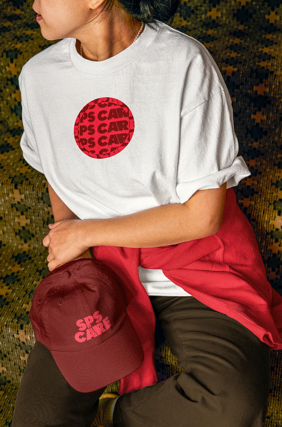
  • Use a symbol that scales across real-world applications (balls, caps, apparel, banners, signage).
  • Make the program structure and benefits instantly understandable through an intuitive website experience.

The Approach: Brand Narrative, Scalable Symbol, and Image-Led Digital Experience

We began by shaping a clear brand narrative: SPS CARE as a confident school partner that creates opportunities for students through sport. From there, we developed a compact, dynamic logo designed to work everywhere readable in small sizes, strong in large formats, and easy to apply across merch, equipment, and campus materials.


The visual identity was built to feel energetic and modern while staying universally legible. We introduced a colorful, high-contrast system that communicates “sport + positivity” in a way that kids recognize and parents trust. The identity was designed to be used, shared, and repeated - not only as a logo, but as a flexible system for ongoing communication.


On the website, we translated the same idea into digital clarity. We focused on intuitive structure, minimal friction, and storytelling through imagery using real photos of kids in motion to make the purpose immediate and convincing. The result is a website that feels energetic, but never confusing: it explains the program, the benefit, and the partnership model in a way that works for both schools and families.

The Outcome: A Confident Identity and a Clear Foundation for Growth

The result is a bold, scalable brand identity and a clear, high-impact website that represents SPS CARE with confidence. The system captures the speed and emotion of football while remaining approachable and easy to understand across audiences. From real-world applications to digital touchpoints, SPS CARE now has a foundation designed to support growth, partnerships, and consistent school adoption.

A football-led identity built for real-world use and a website built for instant understanding.

“H&F-Studio delivered exactly what I hoped for a brand and website that feels energetic, modern, and very clear for schools and families. The process was smooth, and the final result exceeded expectations.”

— Javier | Operations Lead & Program Director at SPS CARE

Have a vision that’s bigger than today?

We’re listening.

Based in Kraków, working with clients wherever we’re needed.

Thank you! Your submission has been received!
Oops! Something went wrong while submitting the form.